Newer, Smaller iPod Shuffle

11 03 2009
shufflekey

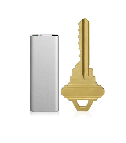
New to the list of Apple’s recent product revisions is the now smaller $79.00 iPod Shuffle. They sport 4 GB storage in a 1.8″ x 0.7″ x 0.3″ housing weighing less than an ounce. It can play for about 10 hours from a full charge, and as always is compatible with Mac and PC through iTunes.

Apple quietly updated the iPod Shuffle today, closing the online store early in the morning and reopening it with the new iPod. The iPod Shuffle is much like the his older cousins, small, sleek, and uses a clip to hold on to whatever you want. The Shuffle comes only in two colors, silver and black aluminum, and the clip is made of shiny stainless steel.

The major feature Apple is pushing for this new iPod Shuffle is VoiceOver, which can tell you the song you are playing (without interrupting the song), recite playlists you have loaded onto it, and warn you when your battery is low. This is a great improvement over the old shuffle, where you were stuck with one playlist, and there was no way to find out what song you were listening to. However, the computerized voice may get on your nerves if you are sensitive to it.

Lastly, when you buy the shuffle, you are stuck with Apple’s earbuds. They have removed buttons from the actual device, and have placed them on the right side earphone cord. Although this is handy, if you don’t like Apple’s earbuds, there is nothing you can do about it until an adapter comes out, and that adapter will be a separate purchase. Not to mention the controls you will have to memorize a combination of controls just to use it, take a look:
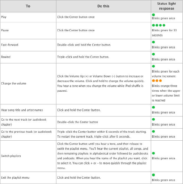
shufflecontrol

Pros: VoiceOver, Smaller, Long Battery Life, Very Nice Look

Cons: Proprietary Headphones, unknown Adapter price-tag, VoiceOver voice can be irritating, only 2 bland colors (black and silver)

If you plan on buying an iPod, the Shuffle is the cheapest and does music like all the other iPods. You lose out on the screen and video that the 8GB $149.00 iPod Nano would give you, though if you only want the music in a small package, Apple has the answer in a fashionable package.


iPod Touch – More Fun

17 02 2009

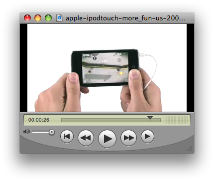
This is a new iPod touch advertisement. It has just been published to The Daily iLife podcast, which you can subscribe to in iTunes or watch here.

This commercial is similar to the last iPod touch ad, showing off even more games you can get in the App Store featuring No You Girls by Franz Ferdinand.


App Store Review: Enigmo

17 02 2009

enigmopic2

Enigmo is a game with a simple concept – get the water/fire/oil into their respective containers. You get to use a variety of tools, like ramps, cannons, sponges, and springs to move the droplets around the level. The goal of the game is to fill up containers to their maximum of 40 drops, simultaneously,  to move on to the next level. What’s interesting is that you also have to deal with obstacles, like force-fields that you have to turn off by shooting some of your drops through a ring to shut the force field down.

There is a lot of content in this game. The game comes with 50 levels, and you can download user-generated content so you never run out of challenges. But you won’t fly too quickly through all of the original 50 levels, some are very difficult and require a lot time to figure out.

enigmopic1

The biggest downfall of the game is that the difficulty curve isn’t gradual. At times you’ll be ready to delete the game  in frustration because it’s so hard, and you don’t want to deal with it anymore, but then the next level is a cakewalk.

For the $1.99 price tag, you could do a whole lot worse than Enigmo. The game gives you a lot of content for a small price, and when you feel like your brain needs some exercise it’s a great little game to play.


A Revolutionary Notebook: The History Behind the 17-inch MacBook Pro

12 02 2009

Since the new seventeen inch MacBook Pro hasn’t reached customers hands, take a look at the new features introduced in the latest model and more importantly, what it means for new Apple notebooks to come.

Unibody MacBook Pro 17"

On January 7th, 2003 Steve Jobs took the stage at the Macworld Expo and declared 2003 the “Year of the Notebook”. Alike the 2005 “Year for high-definition video”, after a few years, the industry caught up with Jobs’ prediction. Last quarter, Apple sold 2.524 million Macs of which, 1.796 million were notebooks- which equates to 71 percent. In the beginning of 2009, well over 36 million households owned one or more high definition TV- compared to 5 million in 2005.

In October 2008, at the “Spotlight on Notebooks” media event held at the Cupertino Campus, Apple introduced a redesigned 13 inch MacBook and 15 inch MacBook Pro- leaving the 17 inch unchanged. It wasn’t until three months afterwards, at the 2009 Macworld Keynote, until Apple took the wraps off of the unibody seventeen inch MacBook Pro. Not only did the new 17 inch MacBook feature a new unibody enclosure and the redesigned trackpad, but also an eight hour battery life and Matte display option.

The eight hour battery life comes with the addition of a 95 watt-hour Lithium-Polymer battery. By utilizing this technology, Apple achieves a significant space improvement over the Lithium-Ion or even Nickel Metal Hydride in some low end laptops. However this not a new technology- Apple has been using Lithium-Polymer battery for a number of years to create more dense and compact batteries.

17-inch MacBook Pro Adaptive Charging

The true innovation is in the hardware and software design of the battery system. A new recharging system dubbed “Adaptive Charging” closely monitors the charge of each cell and provides the optimal current required to recharge them. This monitoring system will allow users to get over 1000 charging cycles instead of industry standard 300.

Although many are quick to criticize the idea of a non-user replaceable battery, the change does allow for a smaller laptop design. The same argument has long been applied to the iPod, iPhone and MacBook Air- but seem to have little effect on the sales. While some may disagree with making the battery non user-replaceable; it is clear Apple is making the move toward Adaptive Charging and internal batteries.

Just as the original 17 inch PowerBook G4 exclusively featured a backlit keyboard with ambient light sensors, the once exclusive feature eventually trickled down to the consumer line MacBook. Within a few years, as the component price drops, all of Apple’s notebooks should see the switch to an internal battery as they gain the Adaptive Charging technology and intern a thinner profile.

Since the 17 inch MacBook Pro hasn’t reached users hands yet, we don’t know what the real battery life numbers will be. But regardless of what the numbers turn out to be, any improvement in battery life is welcome. The 17 inch laptop has brought us countless innovations that eventually trickle down to the entire notebook line.

For more information, check out:

Closer look at Apple’s new battery

Introducing the longest lasting Mac notebook battery ever

PowerBook G4 Commercials:
Introduction
Big and Small
12 and 17 inch PowerBooks


The iLife Enters Yet another new Phase of LIfe

10 02 2009

In what seems like a never ending quest to perfection, I’ve gone through a great deal of time trying to refine the site. As anyone who has been in the situation might know, in this ultra competitive market, it is near impossible to come anywhere near the well established and professional bloggers. This an area that The iLife has never tried to touch, but rather fill in the gaps left in between.

Since I’ve been in college for almost six months, I’ve obviously lost a great deal of free time that I once had to dedicate to the site. It has made me question what I want to do with the site and think about new directions to take The iLife while maintaining a successful academic and social life. So from here on out, I’m suspending all previous journeys we’ve been undertaking for a new approach- truly great and original content.

I wouldn’t ever want to think about the work any of the writers here at The iLife have done as unoriginal, but in order to really drive the traffic and expand ourselves we need to take up a new, stronger direction. This means much more personal blogging, a slightly adjusted writing style and other smaller changes in the back end. So stay tuned- for real this time. We’ll be back in full force very soon.


In Sync: Nuevasync has new features!

20 01 2009

If you don’t know what Nuevasync is, see my previous article for more information and how to get started using it.

This just in! Nuevasync has just gotten better!

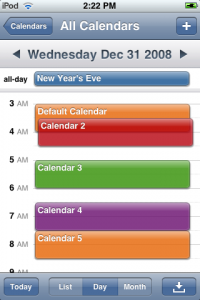
Nuevasync has now released two of their most requested features, Selective Calendar Syncing , and multiple, separate calendars (which you can color code!). You can sync up to 8 separate calendars.

Nuevasync Multiple Calendars

You can now also sync read only calendars, like holiday calendars or anything else your given share only access to.

Also, unlike using Exchange with Outlook, your secondary calendars can have alarms and reminders.


Vs.: HTC FUZE

14 01 2009

I have recently acquired a review unit of the HTC FUZE for a two week demo. After much playing around and living with the unit, here are my thoughts.

Take a look, after the jump:

Read more…


How to get started using BrightKite: Signing up and your first Post from your Comptuer

30 12 2008

In the upcoming series focusing on BrightKite, you will be able to learn how to setup and use the BrightKite location based social network.

BrightKite logo

BrightKite, a social network aiming to create a community based on the places people frequent was founded in Devner only last year. It entered a private beta period for almost about eleven months, and recently opened it’s doors to the public earlier this month. So if you don’t have an account- get one now and read on to get started using BrightKite!

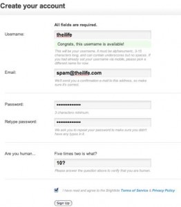
First thing is first, you need to get an account from BrightKite.com. The process is simple, but I’ll walk you through the first steps:

BrightKite Create Account

After you’ve entered all your account information, you can click next and be prompted with the next steps.

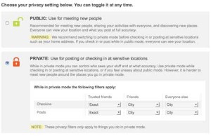
BrightKite Privacy Settings

By selecting your default privacy settings, you can control how much information you share and who else can see it. At any given time you can still toggle back between the modes, so this step isn’t crucial. To get the most out of BrightKite, I recommend using the “Public” setting- but beware that it will let others see where you have checked in.

BrightKite Check In

The next step will be to check in for the first time. While this isn’t required, you’ll want to check in at some point anyway- so why not? Simply enter a location where you are, which can be detailed as a street address or as vague as a zip code- or just a business address and press “Check In”.

BrightKite What's Happening

After that you will be displayed with “What’s Happening” in your area- which can either be populated with other BrightKite users activity around you, or empty because there is not enough activity. Above is the main web interface- which can seem a little confusing at first.

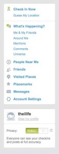
BrightKite Left Side Column

Broken into three parts, it’s rather trivial. The left most column is where all the action lies, where you click to Check In, have BrightKite guess your location (using nearby Wi-Fi hotspots) see What’s Happening around you, in the BrightKite universe, with only your friends. You can also see comments on your activity, mentions from other BrightKite users, visited places or your placemarks (places you bookmarked).

What's Happening?

The next two columns can change based on what you mode your in. For example, if you’ve selected the What’s Happening? The main view is focused only on things going on around you, comments or mentions to you, the entire BrightKite universe or just your friends. If you selected Visted Places, you’ll see a list of all the places you’ve checked into.

With this information, you’ll be able to get started using BrightKite. In the next article in this series, we will explore new ways of checking into BrightKite from mobile devices such as iPhone, iPod touch or just a simple cell phone. We have to thank Brady Becker, BrightKite founder, for helping me write this tutorial!


BrightKite: Social Networking meets the Real World

27 12 2008

Looking to explore some new ways of sharing your location? BrightKite offers the best tools for sharing your location.

BrightKite

Looking to sign up for yet another social network?!? In a crowed field of social networks, a Denver startup BrightKite aims to bring social networking down to the real world. While social networking has gone undeniably mainstream, with over 120 million active Facebook users and 3.2 million Twitter accounts, BrightKite’s network differs in an interesting way- bridging the real world to the internet. For those familiar with the iPhone application Twinkle, BrightKite borrows a few location concepts from Twinkle and builds a social network around them.

bright-kite_stream

On BrightKite, users may post about what is going on at a given location via a Photo or Note. Users can also “Check In” and show other users their current location. On your computer or iPhone, BrightKite can utilize location based services such as Skyhook (a Wi-Fi location service) or GPS to automatically approximate your current location. Additionally you have the option to manually input your location through a specific address business name or a preset “Placemark” (a bookmarked location).

BrightKite Map View

After Checking In on BrightKite through a web browser, you will see a map of your current location and a list of other BrightKite users who have recently checked in around you. Once you have added friends, you will also see their activity in your Placestream. You can then explore what your friends or other people are doing in more detail, view photos or notes they posted and even browse individual user profiles. The same applies if you are accessing BrightKite from one of the many supported mobile devices.

BrightKite Private View

If you consider your location to be sensitive information (which you probably should), BrightKite makes it simple to hide anything you don’t want others to see by allowing your information to be displayed either publically or privately. Beyond that, you can set many levels of privacy and accuracies that can even extend to your friends on an individual basis.

iphone

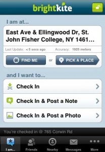
With the native BrightKite iPhone application, you can do virtually anything the full BrightKite website can, and on an iPhone 3G, the GPS hardware makes posting your location downright awesome. The application is very attractive, easy to use and doesn’t compromise any functionality.

In summary, BrightKite’s unique offerings make it a noteworthy social network, although it probably won’t replace Twitter or Facebook. While BrightKite is still currently in beta, if you go to their website and enter your email address, you can get an invite within about 24 hours (usually less).


For your new iPhone 3G: A List of the Top 8 Best Free Applications

25 12 2008

Whether you just took the wraps off a new iPhone or iPod touch or you’ve had one for months now, you should make sure you know about the following applications.

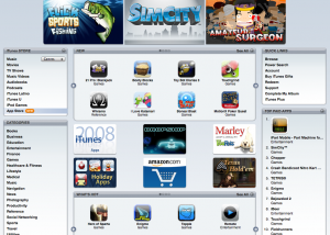
iTunes Application Store

The iPhone is a powerful mobile phone. Since July, developers have been flooding the App Store with innovative and powerful applications which have only bolstered the community. Now with over 10,000 applications to choose from, make sure you have checked out the ones on this list!

SteadyCam

SteadyCam: If you are tired of taking blurry pictures from your iPhone, by using this application in low lighting situations you can avoid future blurry shots. Utilizing the accelerometer, once you push the shutter button it will only take a picture when the motion is the least, thus giving you a clear picture. AppStore link

Night Stand

Night Stand: Ever need a digital clock? Night Stand provides a wonderful digital clock which you can customize to your liking which can be great when you’re traveling. App Store link

Google Mobile App

Google Mobile: Recently updated with voice recognition technology, this application can prove extremely useful when in the need of information. Combining a number of a iPhone services such as location and your Contacts, it will provide relevant information based on a number of variables. App Store link

Units

Units: If you’ve ever needed to convert quarts to gallons or cups to ounces, Units solves the issue of converting units quite nicely. Units makes for quite a bargain when compared to other paid applications that do the same thing. App Store link

WifiFinder

WifiFinder: Whenever possible, a reliable Wi-Fi network is always a great asset. However, due to the nature of the iPhone OS, finding a good network that actually works and is within your range can prove difficult. WifiFinder helps by giving more information about each network and avoids the traditional Settings>Wi-Fi menu route. Definitely a great application for when you’re on the go. App Store link

EasyWriter

EasyWriter: If you have ever desired a landscape keyboard in Mail, this application lets you write with the landscape keyboard and send the text to Mail. App Store link

Wikipanion

Wikipanion: If you browse Wikipedia in Mobile Safari, you know that there is no mobile version. Wikipanion automatically formals Wikipedia pages for better mobile consumption and includes a number of great features such as Ogg audio playback, text resizing, page searching, history and more. App Store link

Say Who Dialer and Maps

Say Who Dialer and Maps: If you miss voice dialing from your previous phone, or would like to use the feature on your iPhone Say Who Dialer and Maps will do the trick. Simply say a contacts name or a number you would like it to dial and it will dial it for you automatically. Additionally you can input an address or intersection and it can launch Google Maps. App Store link

Since the iTunes Store now contains over 10,000 applications there are dozens of new applications that are released each day. If you find an application that you believe is noteworthy, feel free to contact us and we will write about it!